During my time in art school, I used very often gouache and acrylic paint for my works.
Paint was a medium that I liked a lot, but kind of stopped using when I was graduated, because I wanted to perfect myself on drawing in Photoshop.
Lately, I feel like experimenting different techniques, and I really want to reintroduce traditional techniques in some of my artworks. I always was attracted by watercolor, but didn't have the chance to try it until recently.
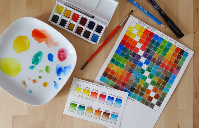
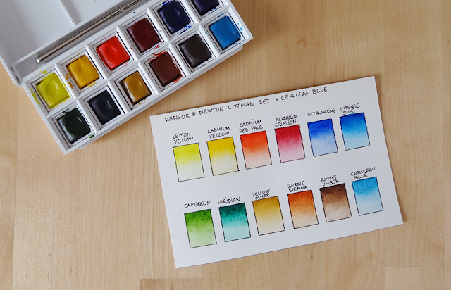
I have a Winsor & Newton watercolor set of 12 pans, but replaced the white with a cerulean blue, because I thought this set was missing a softer blue.

Before starting an illustration with watercolor, I wanted to get familiar with this set, and see all the potential these 12 colors could give. So, I started experimenting with color charts!
Making color charts is really relaxing and also very instructive.
While making this gradient chart, I discovered that some colors were more difficult to work with than others. The ultramarine was more grainy, and the blue colors generally were the ones I struggled with the most to build nice gradients.

While searching tips on how to make the best color charts, I found a very interesting video showing how to get all the possible color combinations out of a watercolor set. I loved doing this chart. It was a bit time consuming, but it was great to see all the colors you could create with just 12 pans.

No comments:
Post a Comment